
Pho An - Responsive Website
Project Overview
Client: Pho An
Role: Product Designer
Duration: 80 hours in 4 weeks
Challenge
Pho An Vietnamese Cuisine is a popular Vietnamese restaurant based in Aurora, Ontario. Small and family-owned, they’ve been able to operate without a website since 2016. Now with the Covid-19 pandemic, Pho An needs to streamline the ordering and pick up process by giving customers the information they need before arriving at the restaurant’s location.
Solution
Update Pho An’s visual and brand identity.
Design Pho An’s responsive website from end-to-end
Create a realistic prototype demonstrating features and functionalities.
Scope
Responsive ecommerce website, logo, branding
Team
Robyn Fiorda (Myself)
Alan Hurt Jr. (Product Manager)
Other UXA Designers (Group Crits)
Tools
Figma, Photoshop, Procreate
My Process

1. Empathize
Secondary Research
Market Research
I started this project by learning more about Canada’s $90 billion foodservice industry. Restaurant sales in Canada have grown over the past five years and over half (54%) of Canadians eat out once a week or more.
Since factors such as marital status and gender affect how often people eat out (men and singles are more likely to eat dinner at a restaurant every day than women, married, separated or divorced), I looked at the demographics of the suburban town of Aurora where Pho An is situated to get a better idea of who the direct customers are.
Aurora is a small town in the Greater Toronto Area, population estimate: 62, 742
0 - 19 years old (22.9%)
20 - 32 years old (20.3%)
35 - 49 years old (19%)
65 - 74 years old (8.4%)
80 + years old (3.3%)
Race
Predominately caucasian (73% of population)
Visible minorities: Chinese (10%), South Asian (3%), West Asian (3%), and Black (2%).
Occupation
Most common occupations: management, business & finance and sciences.
Aurora may not be particularly diverse, but it turns out Canadians are craving ethnic foods. Three quarters (73%) of Canadians like to experience other cultures through food, and more than half (57%) indicated they are more willing to try ethnic foods than they were a few years ago. Canadians also care about food quality, and they care about eating healthy (especially women and mothers). This is great news for a Vietnamese restaurant offering healthy asian dishes in a town with families.
When I looked at online behaviour, Canadians are ordering food online with delivery apps and over 70% of users prefer to check the restaurant menu on the restaurant’s website to make their dining decisions.
My initial secondary research revealed telling information (demographics, behaviours and trends), which gave me an overview of Pho An’s customer base.
Competitive Analysis
I conducted a competitive analysis with restaurants offering similar food but from a range of business sizes - some mom-and-pop shops, some chains, some in close proximity to Pho An. Analyzing this information allowed me to understand how Pho An can position themselves in the industry and gave me a clear understanding of what purpose restaurant websites serve.

Provisional Personas
After conducting secondary research I had an idea of who Pho An’s customer base might be. I took my secondary research and created provisional personas to empathize with the goals and pains customers face while interacting with the restaurant online and in person.

Primary Research
User Interviews
I conducted user interviews with 6 Pho An customers. They were asked about both their in-person and online experiences with the restaurant to help me identify what insights and needs I needed to design for.
Empathy Map
I transcribed the user interviews and recorded each observation on a sticky note. I grouped similar sticky notes together. These sticky notes formed clusters, which revealed patterns across participants I interviewed.

From my empathy map clusterings, these 1-1 insights and needs were uncovered:
Insights
The quality of the food affects customers’ purchasing decisions.
Pho An customers make dining decisions online before going to a restaurant.
Pho An customers want to feel comfortable while dining.
Needs
Pho An customers need to know they will receive high quality food.
Pho An customers need to be able to preview the restaurant options before going.
Pho An customers need to know they will enjoy the atmosphere of the restaurant.
User Persona
“Stacey” is a persona who represents the majority of Pho An customers. She is the medium age of an Aurora citizen, caucasian, married and has children. She has frustrations that were expressed by the majority of users during user interviews and she has the goals and needs uncovered while creating the empathy map.

2.Define
Project Goals
I defined the user goals based on the goals from my persona Stacey, business goals from the project brief, and took into account technical considerations of building a responsive website. I created a Venn diagram to illustrate who benefits from each goal and where there is overlap. I could then focus my project on the goals that overlapped with all parties. I wanted to create a design solution that would meet user goals, business goals and also be technically feasible.

Site Map
To understand how information would be organized on the website, I created a site map based on research and common design patterns from restaurant websites. Since restaurant users in particular may be on the road while looking up the restaurant, my aim was to create a simple website with minimal pages so Stacey would know where to go to easily find the information she needed.

3. Ideate
Task Flows
I created task flows to identify the path Stacey would take to complete tasks while on the website. I gave her three common tasks from different starting points on the website. This allowed me to think through Stacey’s experience.

User Flow
I expanded on my task flows with the user flow, which helped me to plan out the different paths Stacey could take while completing tasks. This further made sure I did not have any gaps in my information architecture.

Sketches
Referencing research and common design patterns, I sketched three low-fidelity wireframes of Pho An’s homepage to get an idea of where elements would be placed and what needed to be included. Rapidly sketching allowed me to explore options before determining the best solution.

Mid-Fidelity Wireframes
I created mid-fidelity wireframes so that I could see the solution in more detail and so that I could test my mid-fidelity wireframes on users. Because Pho An had such a long menu, I decided to break this up into categories by food type. Since users also wanted to see photos of their food, I gave the menu a unique feature where users could click on the menu item text and this would trigger a modal window that would show an image of the food.
Desktop Wireframes

Responsive Wireframes
Referencing the desktop wireframes, I also designed the tablet and mobile versions of the website to ensure an optimal user experience from any device.

4. Prototype
Prototype
I tested the mid-fidelity prototype with 5 participants using the think aloud-method. I specifically wanted to test my assumption that users could find the menu item text. I also wanted to make sure they could complete simple tasks that they would need to perform on the website. I observed for other areas such as how easily participants could complete the tasks, how efficiently they could find what they were looking for, and any areas of confusion or hesitation.
Task 1: Browse Appetizers.
Task 2: Read about the restaurant.
Task 3: Order the vegetarian spring rolls.
5. Test
Usability Test Findings
After interviewing, I created an affinity map to synthesize my research and find patterns.

Overall, most users completed the tasks very quickly (under 6 mins), and most said they felt the tasks were straightforward.
I invalided the initial assumption I had that users could find the modal window by clicking the menu item text. I noticed that while 4/5 users clicked the menu item text to trigger a photo, 3/5 did not expect the pop-up photo. Based on these results I needed to add an icon to make the action of triggering the modal window more clear.
I also noticed that users are more likely to reference the phone number written out than to use a call now CTA button, so it was more useful to the user to just provide the number written out.
Visual Design
Mood Board
Pho An needed a brand refresh, so I came up with attributes that would suit Stacey’s tastes. I choose the attributes authentic, ambitious, elegant, honest, fresh. “Authentic” and “fresh” were also words that customers I interviewed used to describe Pho An’s food. I choose Lora for heading type for elegance and red to symbolize ambition. Brand colours were also inspired by the colours of the ingredients used in Pho like green basil and red pepper.
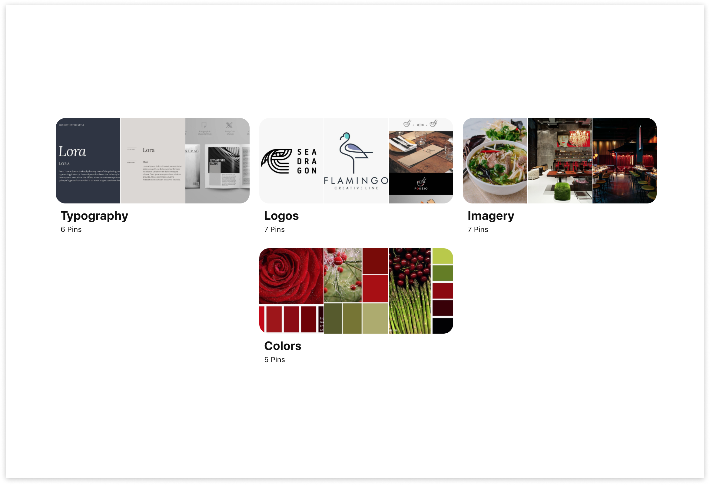
Style Tile
The brand style tile was put together following the inspiration and brand attributes that were defined while creating the mood board. Here I created the final logo of the wordmark with the red basil leaf. The logo was done after sketching and vectorizing it in different scales to make sure it could scale properly.

UI Kit
The UI kit is a collection of every visual element used in the high-fidelity UI designs that was created to show all the components created. I organized all the different elements from my website like buttons, links, and cards, and labeled them. The UI kit was continuously updated as the design was iterated on and helped me to maintain consistency across webpages.

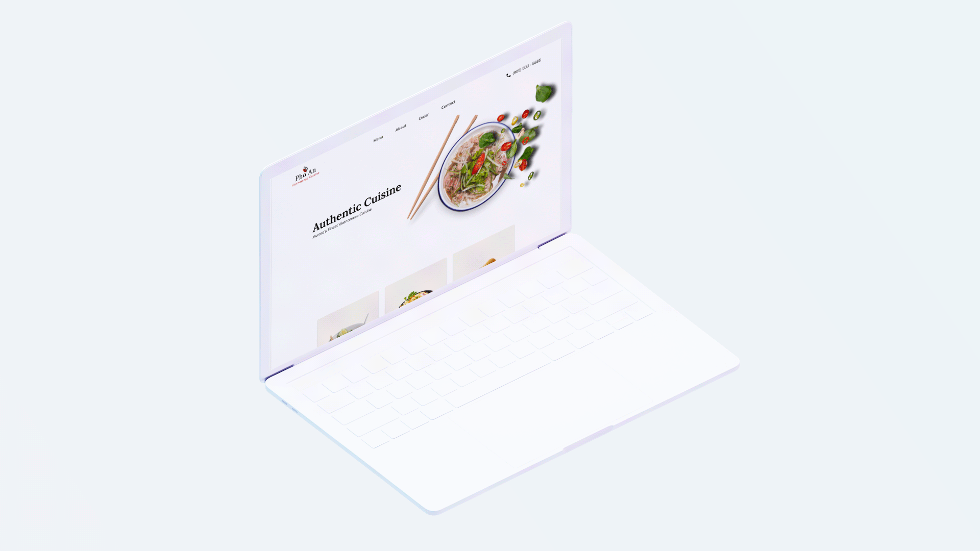
Final Wireframes & Prototype
Once branding was complete, I transferred the visual components from the brand style guide to the final UI design.


Reflection
Since my participants completed user testing very quickly for this project, it forced me to pay attention to other details to improve my design. Since every user expressed how easy they found the tasks, I had to observe body language closely to find the areas that could be improved.
While thinking of a solution for the menu page (since the menu was too long for all the information to be displayed on a single page), I learned how valuable it can be to make assumptions and test them so you can focus on where to improve the design, especially when there is no existing common design pattern for this solution. This was done when creating a solution for the modal window on the menu page.
Next Steps
By following an iterative design process, I was able to design a website that aligns with Pho An’s brand.
I would like to take Pho An’s website to the development stage.
I would like to continue to test and iterate on the designs to create the best experience for our users.